Kalpatharu Substrates
A specialized agricultural substrates manufacturer that needed a complete brand identity built from the ground up.
Service:
Branding
Project Overview
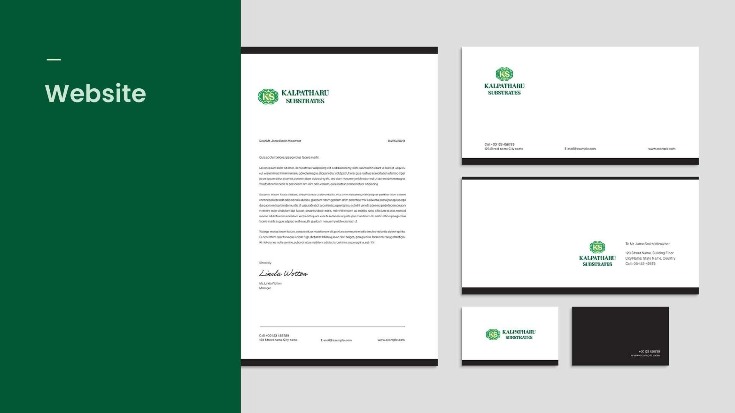
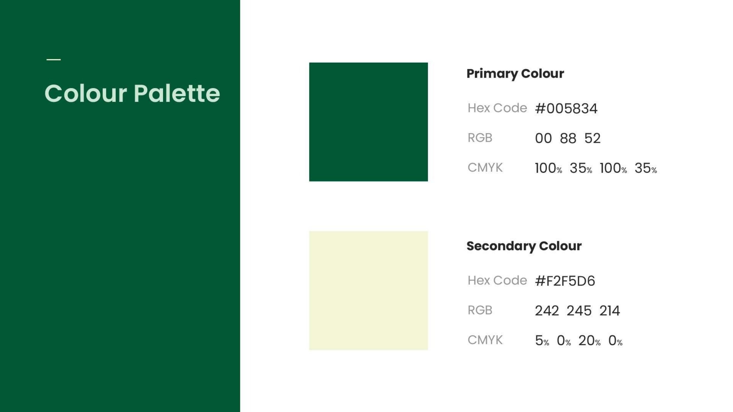
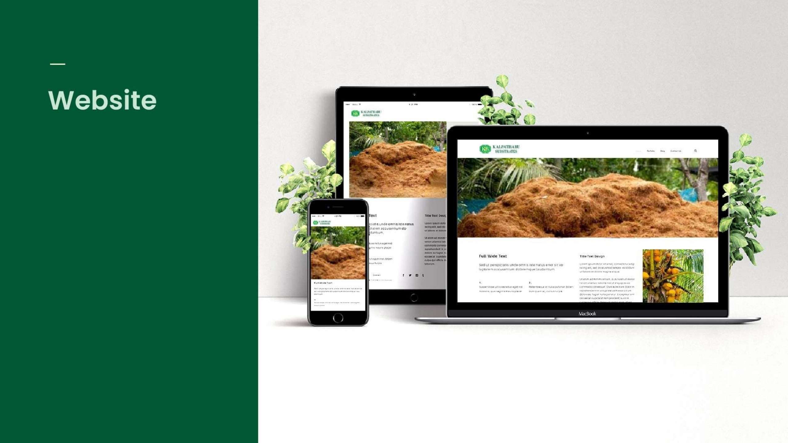
We developed their entire visual identity system starting from logo, color palette, typography, and brand guidelines while ensuring consistency across all touchpoints from business cards to their website.
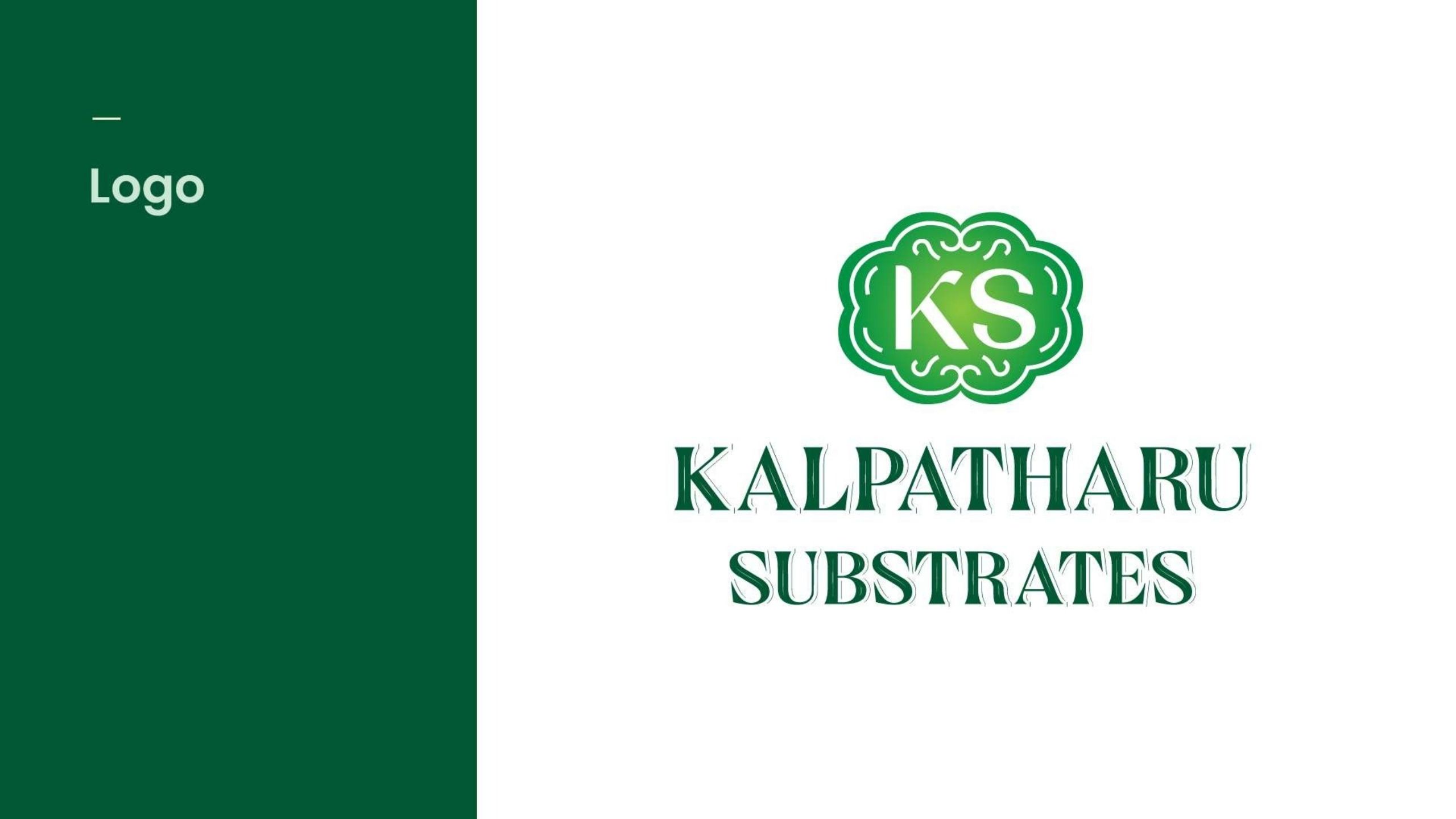
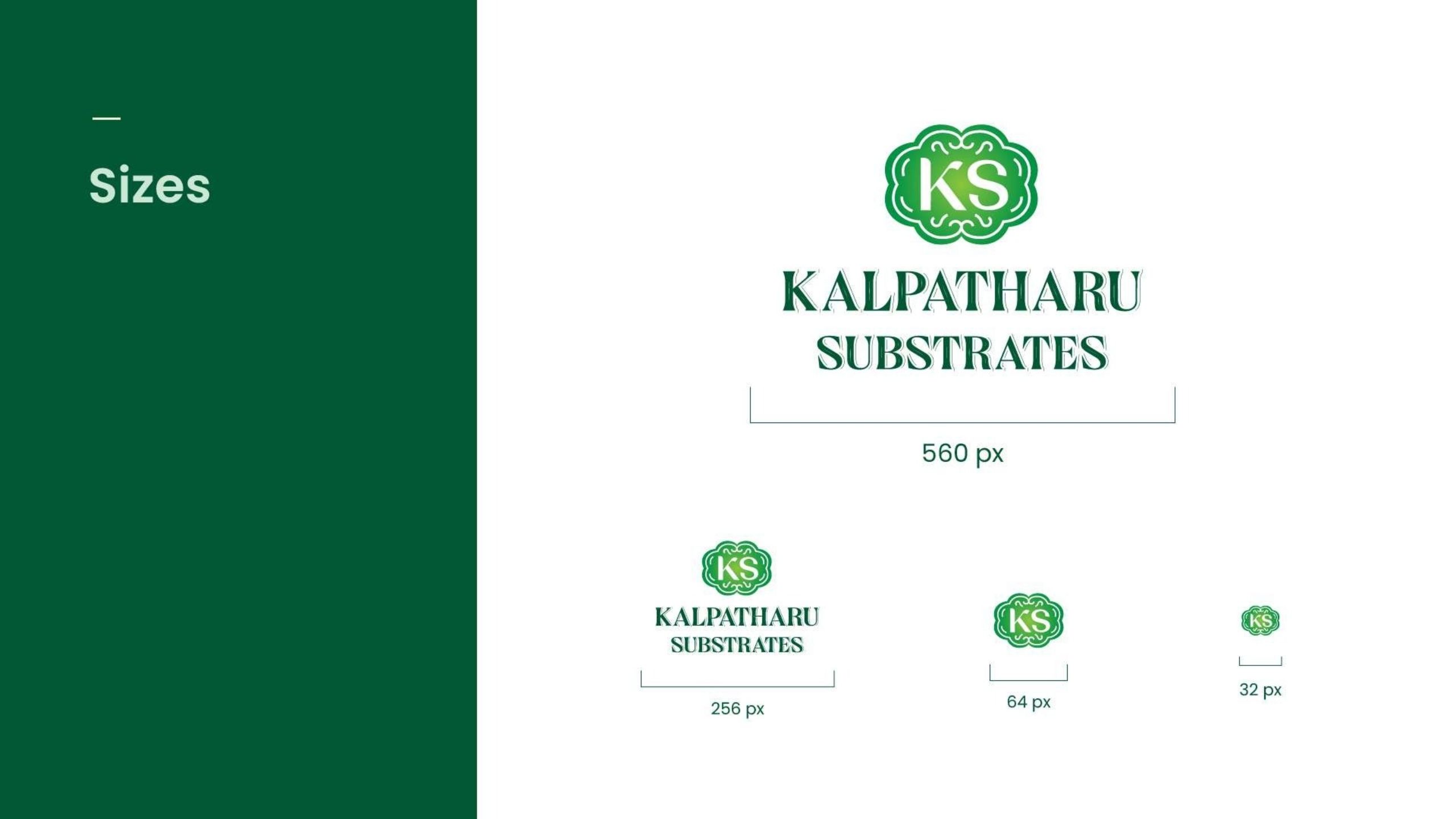
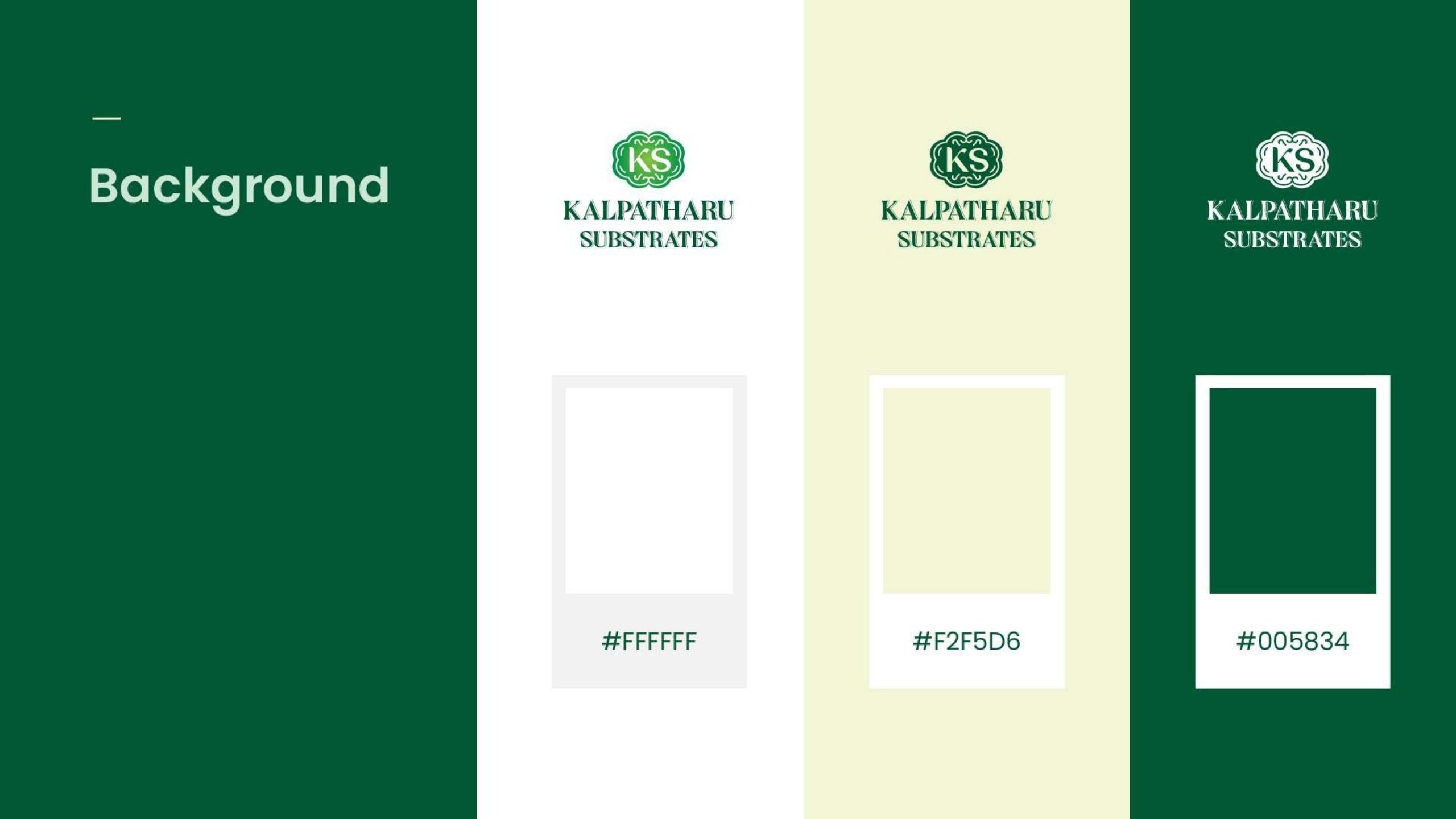
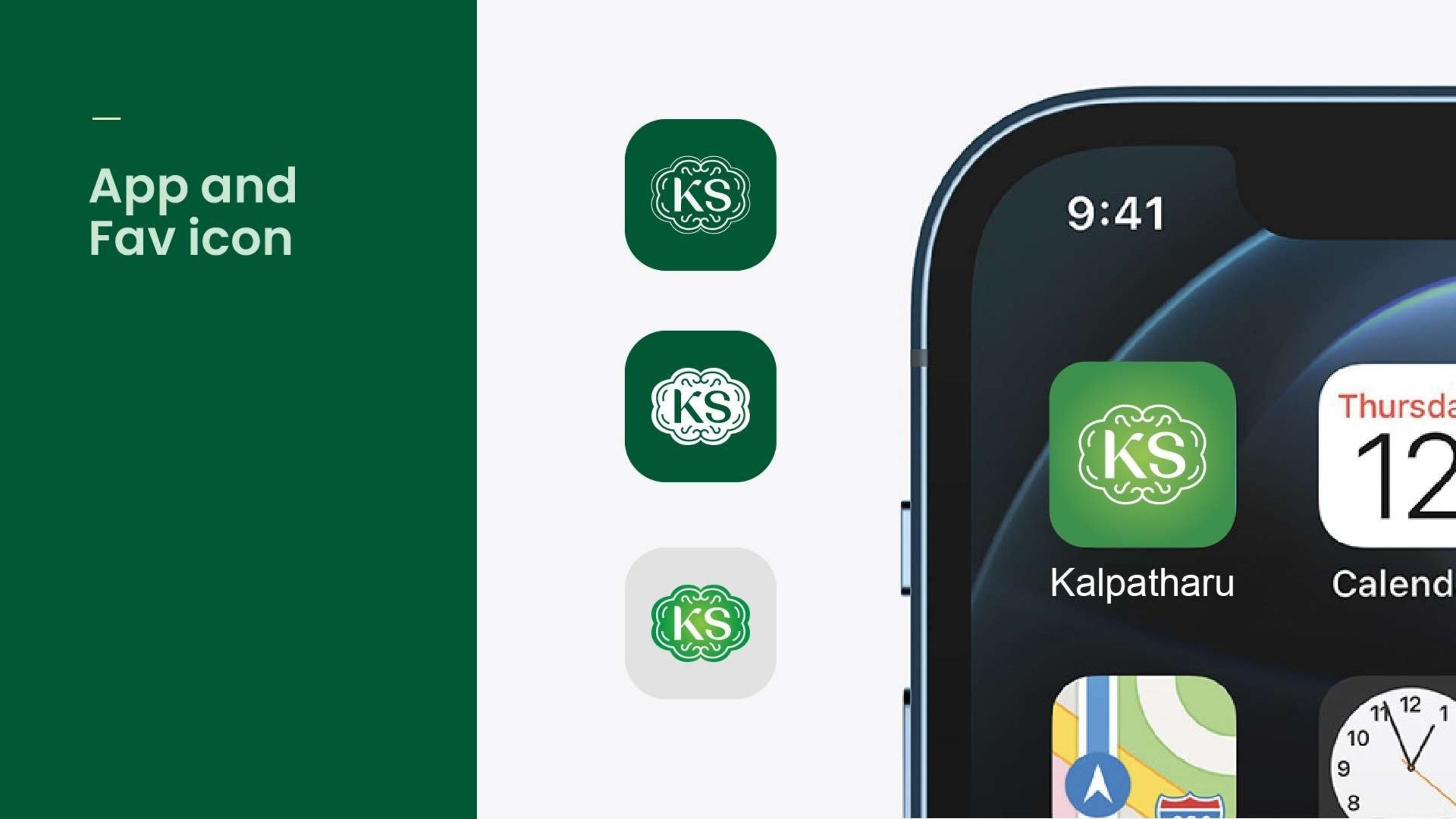
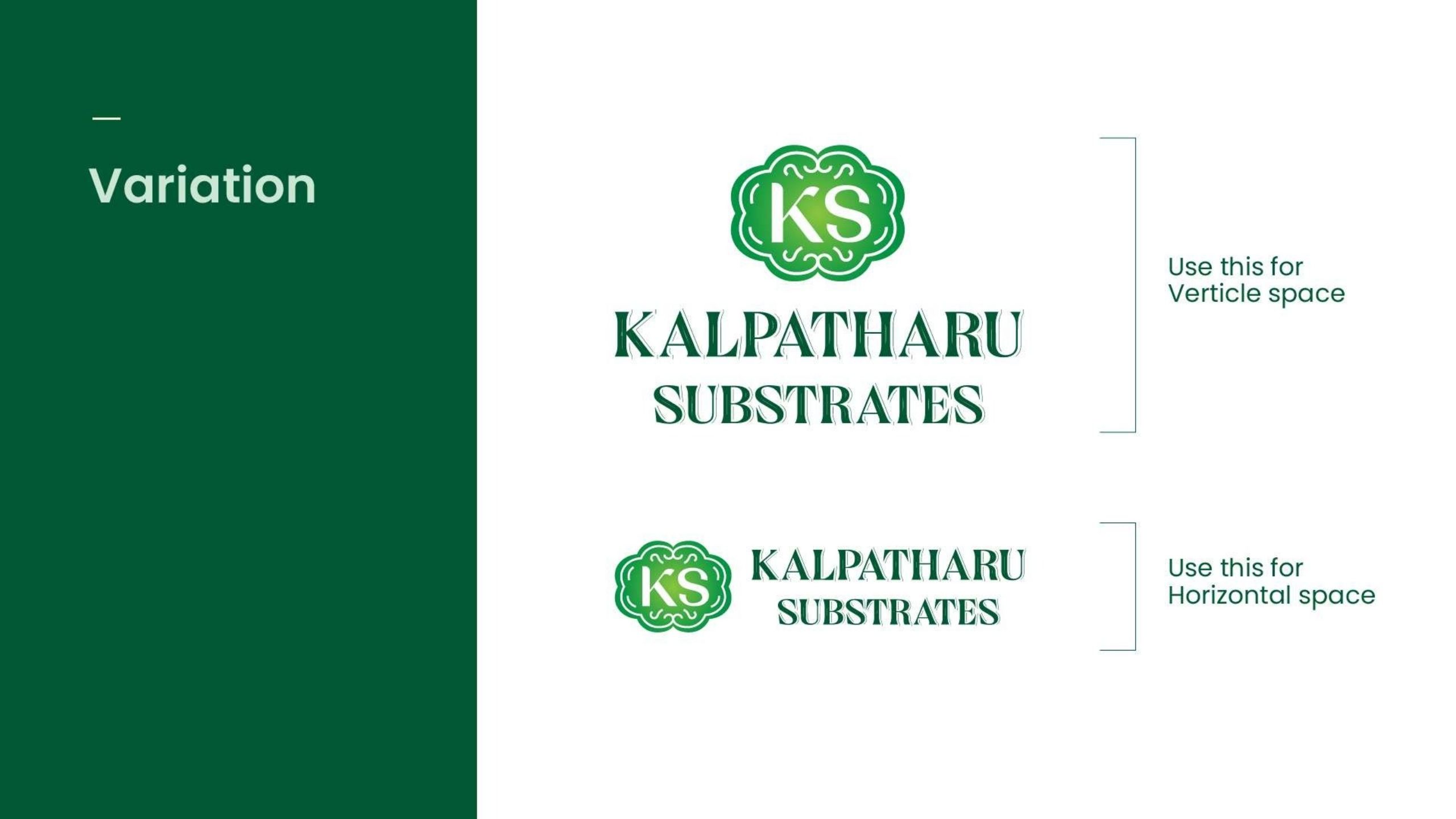
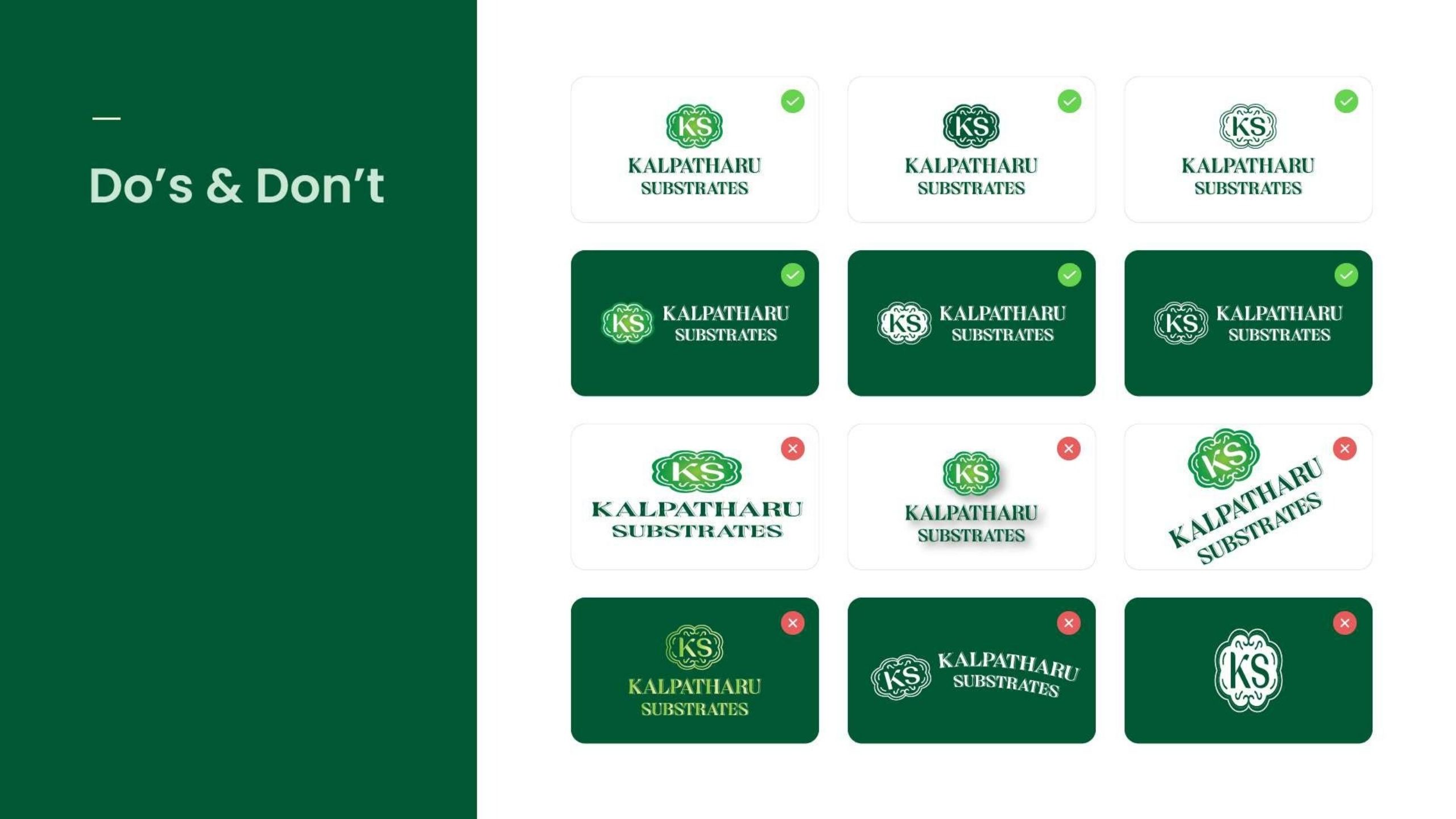
The brand needed to convey natural quality, reliability, and professionalism to agricultural businesses and growers. We created a distinctive KS monogram within an ornamental frame that suggests both growth and structure, perfectly representing what substrates do. Every brand element was designed with scalability in mind, working across digital platforms, print materials, and physical applications.
Project process
The Kalpatharu project followed a systematic brand development approach. We started with understanding the substrates industry, their target customers, and positioning goals. Brand strategy defined their core values and market differentiation. Visual identity development created the distinctive logo mark and unified color and typography systems. We built complete brand guidelines ensuring consistency as they scale.
- Conducted industry research and competitor analysis
- Developed brand strategy defining positioning, values, and visual direction
- Created distinctive KS monogram logo with natural aesthetic
- Established unified color palette and typography system with brand guidelines
Result
Kalpatharu Substrates now has a complete, professional brand identity that positions them as a premium player in the agricultural substrates market. The visual system works seamlessly across all applications, from business cards handed to potential clients to their website viewed by distributors. They've transformed from having no brand identity to having a cohesive, scalable system that communicates professionalism and quality at every touchpoint.
Our Works